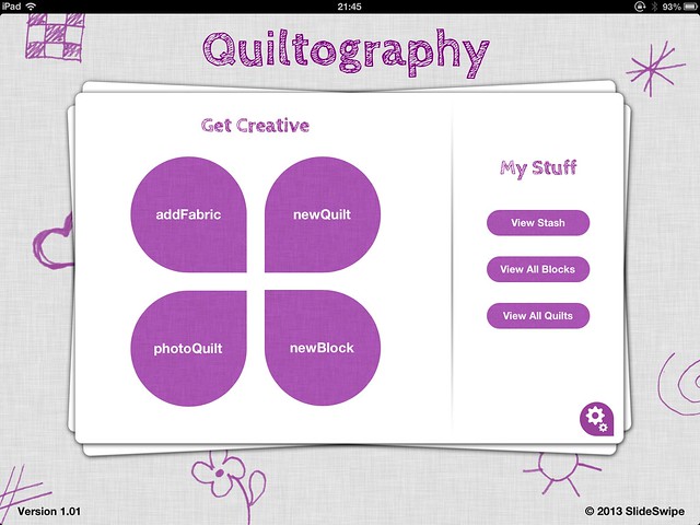
I completely admit to being a 'fan boy.' I know this is supposed to be a derogatory term for people who love Apple products, but I embrace it wholeheartedly. With that said... I'm always on the lookout for apps that apply to either writing or quilting and when I came across a quilting app,
Quiltography with a (relatively) high price tag, I thought, "Well, this has gotta be good."

And it is. I think this is a strong app and from the looks of the developer's
twitter page, suggestions are being taken seriously. The main reason I bought it was for the picture quilt aspect, but I'll get to that in a minute.
The block library is large and there are promises of more to come. It was very simple to take a picture of my own fabric, making it easy to audition fabrics. And the block creator is very straightforward and easy to use. In about 30 seconds I had photographed this Tula Pink fabric and made a block with it.
In about 45 more seconds, I had put together a quilt top; that I deleted even faster, because I didn't care for it.
But that's the beauty of an app like this. Not all of my ideas are brilliant (only about .001% are, to be honest) and it's good to have a way to see that before I've invested hours.
Now, to the real reason I bought this app - the picture quilts. I've been toying with the idea of working my way into art quilts and I wanted to see what this could do for me. There are limitations that the app is definitely not responsible for. It works phenomenally at taking an image, reducing it to pixels, and producing a PDF pattern with step-by-step instructions on how to create it in the easiest way possible. The PDF pattern is absolute genius. The problem is with the pixelization process itself.
The photo the app gives as an example is a cartoon character (Mario, to be exact) with little to no shading and very defined borders and the example looks great. I tried with quite a few pictures in my library and most of them came out like this...
Because the app takes the shortest side of the photo and makes it 50" long (one pixel per inch) and uses that as a guide for how long to make the other side. I've seen that most pictures end up being roughly 50"X70" on the largest setting. I throw some faces in the mix to see how they turned out, and I like the outcome. It could be because our brains are built to recognize human faces a lot easier than park benches; the Man in the Moon, Mary appearing on toast, etc.


But, I don't want my face on a quilt and I can't really think of anyone else I want to look at all the time either - maybe if I were a parent I would feel differently and do a quilt of my kid's face or something. But, as it stands, probably no faces for me. I have found a couple of things that will work well... but, I'm torn... I initially thought that maybe if the squares were a little smaller, the definition would be better, but my very next thought was, "Oh, he**, no." With one inch squares a 50"X70" quilt would have 3,500 pieces, with 1/2" squares, that number jumps to 14,000. About three years into that project, I might get a little tired of it.
What I will never get tired of is the way this program produces a PDF pattern for the picture quilt. It gives a chart of the colors needed...
And gives specific sewing instructions, breaking everything down into 5" blocks. It's nothing short of wonderful.
Luckily, it takes the app less than a second to give a preview of what a photo quilt made with the app will look like, so it's quick and easy to scroll through a photo library and audition pictures.
With all of the functionality of this app and all of the interaction the designer appears to be having with his/her customers, I definitely recommend this app. It's worth the price for the current functionality and as improvements and updates come out, it will be even better.
UPDATE (October 2013)
The gurus behind the app issued an updated version... and there was something in the update that I never ever thought I'd see; the ability to create your own block. Granted, the pieces have to conform to a snap-to grid, but it's still the absolute best I've seen on the market. It allowed me to see how this quilt would look before I made it...
Also, I've been able to use it in interactions with my customers. I was able to send a customer, not only a snapshot of the fabrics I found for her requested design, but also a picture with an idea of how they would look together. It's not exact (mostly because the lighting in my workroom where I took the pictures of the fabric is not the greatest), but it gave her a fairly good idea.

Added functionality makes this app even more worth it - AND, they said they're still adding. I can't wait to see what they come up with next.


